User Experience Design & Research
School Project
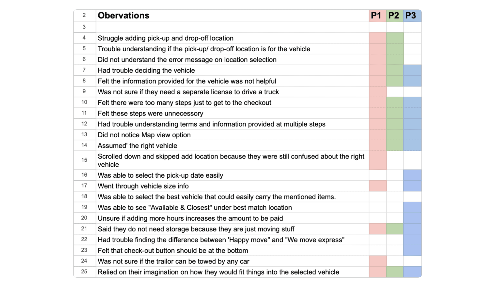
U-HAUL Usability Research
Usability Testing For Booking Flow On U-Haul iOS Mobile App.
Usability Testing
User Research
UX
Background
OVERVIEW
This is a usability testing report for U-Haul Mobile App focused on vehicle’s booking and reservation flow. The research initiated with a high level problem identification and moved on to usability testing sessions with 3 participants. Participants were screened and the sessions were moderated and observed. These sessions were between 15 - 30 mins in which they were given a scenario and were asked to perform 4 different tasks. The findings and recommendations in this research are based on the observations from these sessions.
SCOPE & OBJECTIVES
The scope of this research study is to evaluate user experience of U-Haul Mobile App vehicle booking and reservation journey, identify usability issues and suggest possible solutions for the affected areas. This usability evaluation specifically focuses on vehicle & location selection and additional steps till the checkout. The main deliverables for this report are findings from the usability testing sessions, recommendations, and prioritized improvements.
Methodology
RESEARCH METHODS
Initial assumptions were narrowed down through a high-level heuristic analysis of the U-Haul Mobile App. Based on the identified problem areas, a plan for a usability testing session was created, focusing on the booking/reservation flow. The session included one scenario and four tasks, designed to prompt users to think and make decisions independently. This approach aimed to assess the usefulness of information provided on the app during specific steps.
SCENARIO & TASKS
You live in Etobicoke, Toronto and you are buying a queen bed, coffee table, a medium sized mirror, a lamp and a nightstand for your room from an online seller which is approximately 20-25 Km away from where you live. You have to go to the seller’s location with a vehicle which has enough storage for these items. You have to load these items to the vehicle and drive back to your place.
Task 01: Find and select a suitable vehicle that could safely carry all these items.
Task 02: Add pickup and drop-off location and find out rates for the selected vehicle.
Task 03: Find out suitable locations to pick-up and drop-off the vehicle.
Task 04: Proceed to checkout and review order summary.
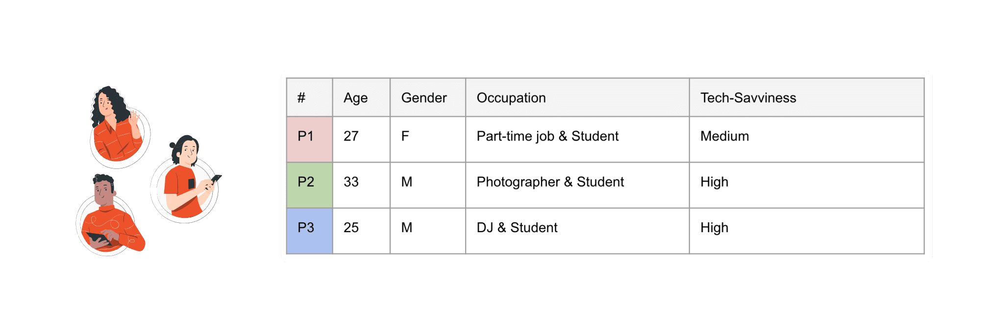
PARTICIPANTS & DEMOGRAPHICS
Target audience for this testing session is individuals between the age of 25 - 50 of mixed genders.
Participant selection was based on familiarity online moving services.
Each participant is attached to one colour throughout the analysis to help identify the most common problem areas.
Data Collection & Analysis
TOOLS & INSTRUMENTS
A recording device for in-person testing sessions.
A set of fake dummy data was provided to the participant.
Mobile device for the participant.
Note taking tool and note-pad for handwritten notes for the note-taker/ observer.
PERFORMANCE METRICS
Complete success: User is able to place an order with no error.
Success with one minor issue: User is able to place an order but faces a minor issue.
Success with a major issue: User places the order but there is a major issue. E.g. enters the wrong date or delivery address.
Failure: User is not able to place the order.
ANALYSIS
This analysis is based on the recordings and observer notes from the usability testing sessions.
Mapped out common themes from the overall video sessions and assigned one colour to each participant. Added user comments and observation notes for each theme along with the screenshots to capture a complete picture of the observation. After documenting the observations for each theme, most common issues from each theme were located with the help of rainbow method and suggested recommendations for the possible solutions for these problem areas with prioritizations.
🚨 Negative Findings
VEHICLE SELECTION
Task 01: Find and select a suitable vehicle that could safely carry all these items.
All participants had to ‘assume’ the right vehicle. They were unsure if the mentioned items would fit or not even after going through the detailed information about the vehicle. None of the participants found the provided vehicle information helpful.
Severity Rating:
S1 = Cosmetic problem only
S2 = Minor usability problem
S3 = Major usability problem ✔
S4 = Usability catastrophe

RECOMMENDATIONS
Provide users a list of items a vehicle can safely carry along with dimension details supported by images.
A tool to assist users and suggest vehicles based on their item selection.
Include real-life pictures and videos of the vehicles with inside view.
*Recommended Design*

Criteria for Prioritization:
P0 – 'Drop Everything and Fix Now': High value, low complexity
P1 – 'High Priority': High value, high complexity ✔
P2 – 'Important but Not Urgent': Low value, low complexity
P3 – 'Fix When Possible': Low value, high complexity
ADDING PICK-UP & DROP-OFF LOCATION
Task 02: Add pickup and drop-off location and find out rates for the selected vehicle.
Participants were confused if this pick-up & drop-off location is for the vehicle.
Majority of the participants failed to add pick-up & drop-off location without realising about it and assumed that it was added.
Some of the participants were still unsure about their vehicle selection at this step. They scrolled down to vehicle information and skipped the pick-up & drop-off location.
Pick-up & Drop-off input does not read addresses. (Database issue)
Live location on Pick-up location does not work.
Severity Rating:
S1 = Cosmetic problem only
S2 = Minor usability problem
S3 = Major usability problem ✔
S4 = Usability catastrophe

👍 POSITIVE FINDINGS: None of the participants struggled with adding Pick-up date.
RECOMMENDATIONS
Update database for the addresses and add live location support.
Change the heading from ‘U-Haul Truck Rentals’ to ‘Vehicle Pick Up & Drop Off’
Remove Drop Off input field for vehicles that do not support a different drop-off location to avoid confusion and add a message to inform the user that this vehicle has to be returned at the same pick-up location.
*Recommended Design*

Criteria for Prioritization:
P0 – 'Drop Everything and Fix Now': High value, low complexity ✔
P1 – 'High Priority': High value, high complexity
P2 – 'Important but Not Urgent': Low value, low complexity
P3 – 'Fix When Possible': Low value, high complexity
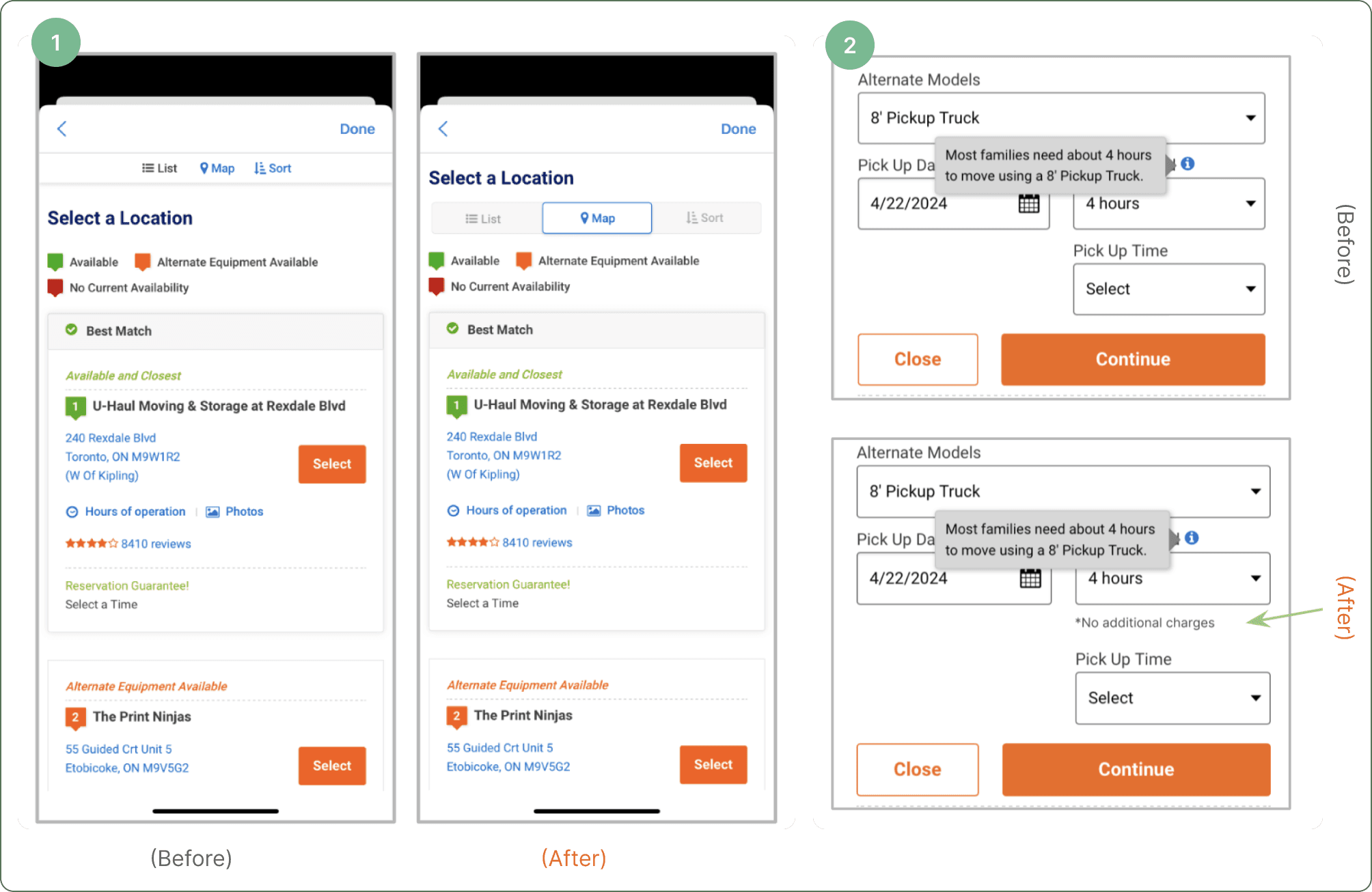
SELECTING THE BEST LOCATION FOR PICK-UP
Task 03: Find out suitable locations to pick-up and drop-off the vehicle.
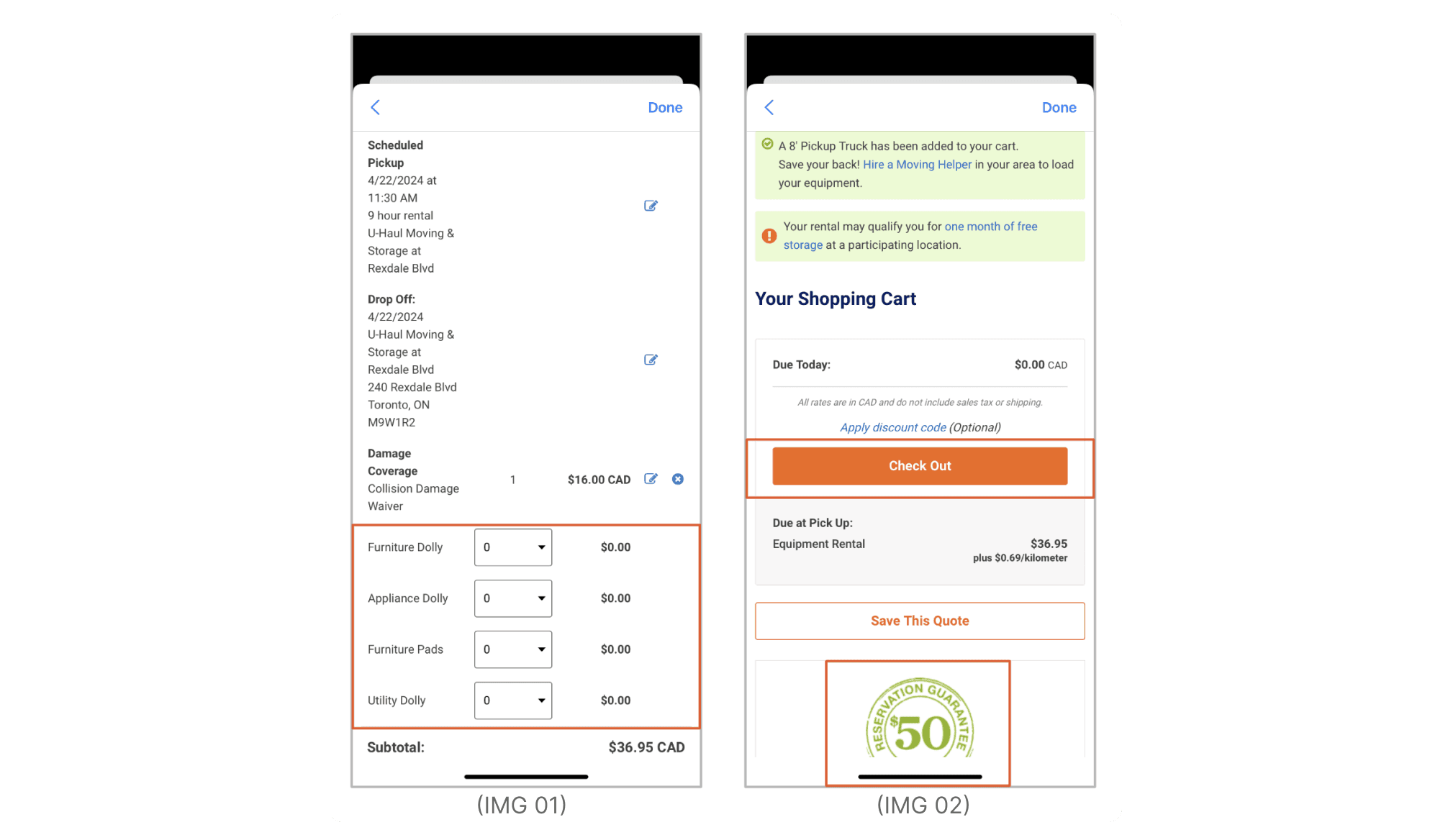
Majority of the participants failed to find Map feature.(IMG 01)
Sorting feature did not work for most of the participants. (IMG 01)
Participant was unsure if adding more hours would increase the amount to be paid. (IMG 02)

👍 POSITIVE FINDINGS: Most participants found the map view helpful.
RECOMMENDATIONS
Make maps, sort and list selection more visible.
Add “ No additional charges “ under hours input field.
*Before and after re-design*
Criteria for Prioritization:
P0 – 'Drop Everything and Fix Now': High value, low complexity
P1 – 'High Priority': High value, high complexity
P2 – 'Important but Not Urgent': Low value, low complexity ✔
P3 – 'Fix When Possible': Low value, high complexity
PROCEEDING TO CHECK-OUT
Task 04: Proceed to checkout and review order summary.
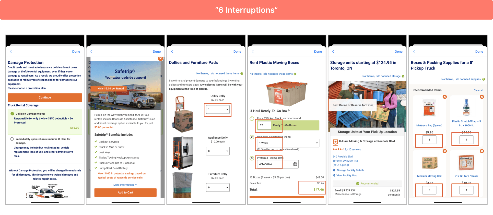
All participants felt frustrated going through 6 different steps in order to reach checkout screen.
All participants felt most of these additional steps were not helpful.
Some of the additional steps with ad-on items already had selected quantities which was not done by the participant.
One participant called these steps “6 interruptions“
Severity Rating:
S1 = Cosmetic problem only
S2 = Minor usability problem
S3 = Major usability problem
S4 = Usability catastrophe ✔
👍 POSITIVE FINDINGS: Participants expressed that it’s good to know that U-Haul provides all these services.
RECOMMENDATIONS
Combine Add-ons in one screen and allow user to learn more about the additional options and add if they like to.
Remove storage Add-on from transportation services.
*Recommended Design*

Criteria for Prioritization:
P0 – 'Drop Everything and Fix Now': High value, low complexity
P1 – 'High Priority': High value, high complexity ✔
P2 – 'Important but Not Urgent': Low value, low complexity
P3 – 'Fix When Possible': Low value, high complexity
ORDER SUMMARY
Task 04: Proceed to checkout and review order summary.
Checkout button is above billing and order summary. (IMG 02)
(Participant expressed that they prefer going through the summary and they expect the button at the bottom)
Reservation guarantee badge was misunderstood for a Coupon. (IMG 02)
Items not part of the order show up under order summary. (IMG 01)
Severity Rating:
S1 = Cosmetic problem only
S2 = Minor usability problem
S3 = Major usability problem ✔
S4 = Usability catastrophe
*Recommended Design*

Criteria for Prioritization:
P0 – 'Drop Everything and Fix Now': High value, low complexity
P1 – 'High Priority': High value, high complexity ✔
P2 – 'Important but Not Urgent': Low value, low complexity
P3 – 'Fix When Possible': Low value, high complexity
Summary of Key Takeaways
This research helped with finding out specific challenges that users face while making a reservation or booking for a vehicle. The issues start to begin from the very first step where the user has to decide the right vehicle till the checkout step. Identified issues range from minor usability issues to usability catastrophe.
Highlighted insights are crucial for enhancing the U-Haul mobile app usability and functionality and addressing these issues can lead to increased user satisfaction, retention, and potentially even business growth for U-Haul.
Appendices