Product Design
School Project
Apple Watchface Design
An interactive Apple watch-face for people who love running.
Product Design
Interaction Design
UX Research
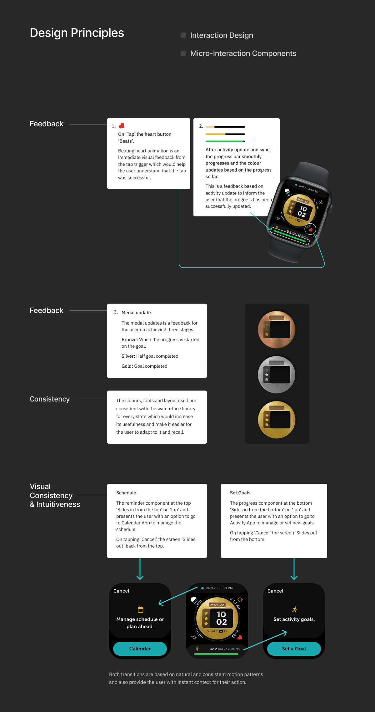
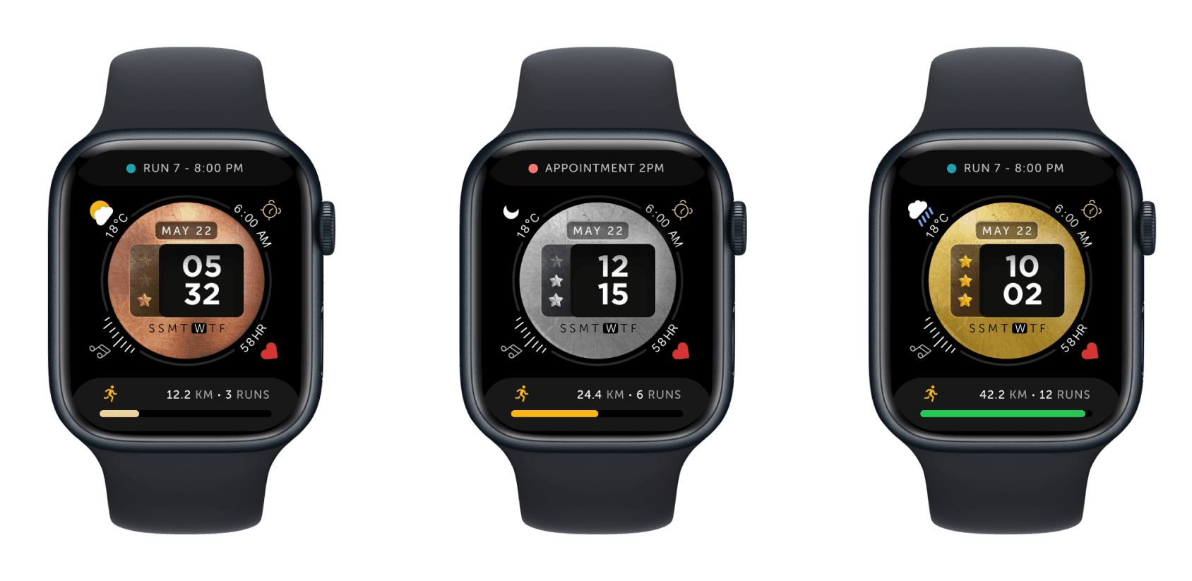
An interactive Apple watch-face for people who love running. Focused on applying interaction design principles to ensure not just functionality but usability, and micro-interactions to ensure smooth and interactive transitions. The core focus of the watch-face is to reflect meaningful information for the runner based on their interests identified through the user research.
Who will be using this watch-face?
People who love running (both casual runners and those who participate in marathons).
Our core user for this watch face is someone who loves to run, likes to set goals, and is an achiever.
Based on our research, people who actively run often participate in marathons for various reasons. Some are interested in networking, while others truly love running.
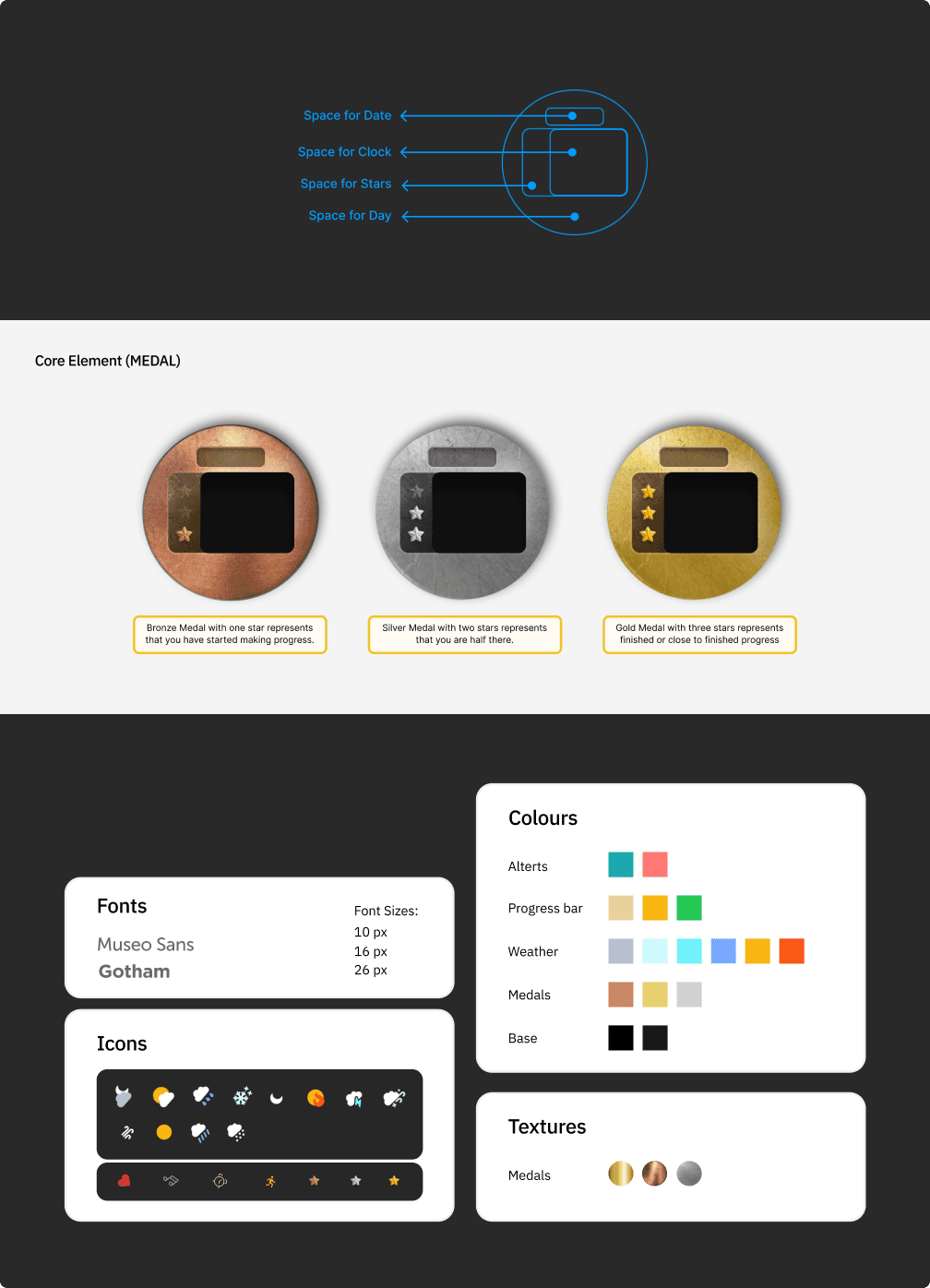
We found one common factor among most runners: they all love medals. Some runners have large collections of medals displayed in dedicated spaces in their homes.
We also discovered that runners like to monitor their heart rate and usually set monthly and weekly goals to keep themselves active.
"I love medals. I know it seems crazy," he said. "They are beautiful works of art."

“One race was all it took for Andrew Queler to get hooked on running, but it was the prize at the end that kept him coming back for more and more races.”

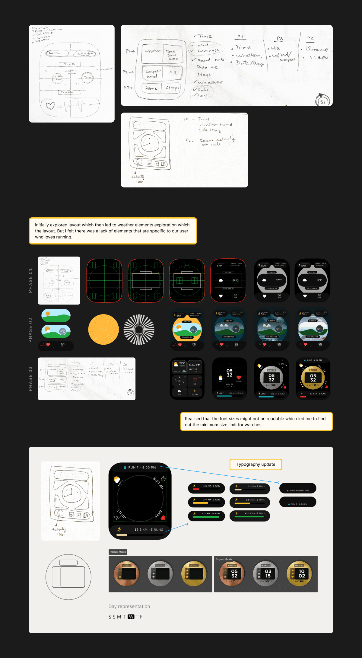
Visual Systems Used
Font family
Gotham (Black)
Museo Sans (Regular)
Colours
A combination on dark colours for the base and high-luminence colours for the elements which would make them more visible under sunlight/ outdoors because of outdoor running.
Clock type
Digital We found digital clocks to be more common amongst our core users which is why we decided to go with a digital clock
Iconography
We went with a minimal design approach and decided customise fontawesome icon library and draft new icons for weather and other components,